 01
01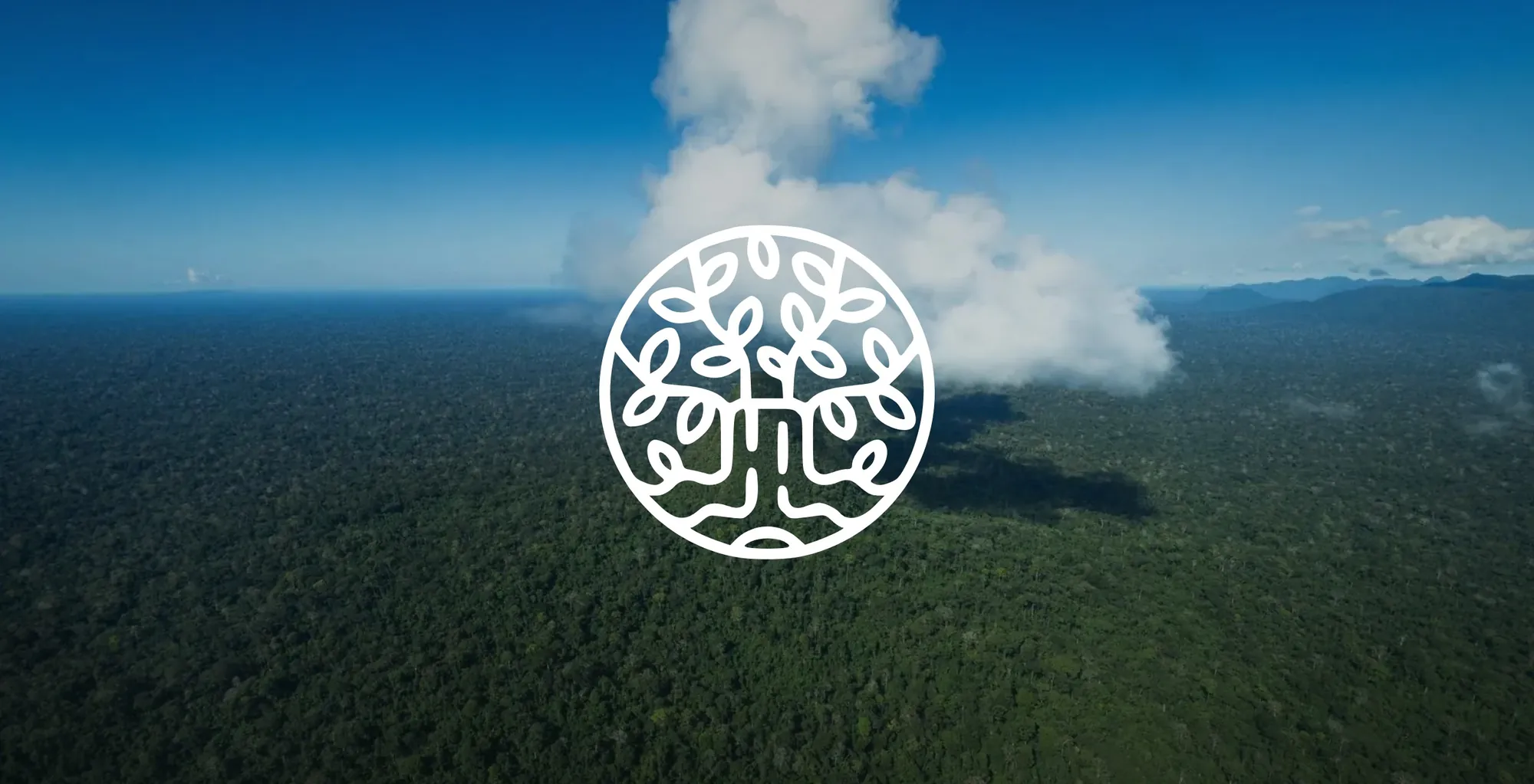 02
02 03
03 04
04Sections
Climate tech websites look like NGOs when they borrow the cues of advocacy, such as mission-first headlines, symbolic imagery and movement language, while the audience is looking for delivery, evidence and a commercial offer. The fix is to put the operating reality beside the mission so a buyer or investor can classify the company correctly in the first screen.
NGOs and public-interest organisations use those cues for good reason, and their sites do their own job well. They ask their audiences to support, join or donate. A commercial climate company asks a buyer to purchase, an investor to commit capital or an infrastructure partner to take on project risk. Those are different decisions, and they call for different trust signals. Investors in particular read a website as an early piece of diligence. They check whether the company describes itself the same way in the deck, on the site and in the data room, and a site that sounds like a campaign while the deck sounds like an operator raises a doubt the founder then has to spend a meeting answering.
Different organisations earn different kinds of trust
An NGO needs to show legitimacy, urgency, community, participation and public benefit. A commercial climate company may share the mission, and its buyer also needs to see what is for sale, where it has been deployed, which specifications matter, how it performs, what operating capability sits behind it, who its commercial partners are and how to start a conversation. If those signals are missing, the visitor classifies the organisation before reading deeply enough to correct the impression.
Web credibility research points the same way. Nielsen Norman Group sets out four credibility factors for trustworthy web design, and the Stanford Web Credibility Project published guidelines for how websites earn credibility. Both treat trust as something a site shows through its content and design. A visitor who cannot find what the company does, or evidence that it does it, will classify the organisation from whatever cues are left. On many climate sites the cues left over are the advocacy ones.
The cues that create the mismatch
No single design choice creates the effect. It comes from a stack of cues that each look reasonable alone. Large landscape photography with no product in frame. A mission statement where the proposition should be. Soft, campaign-style typography. Repeated calls for collective action with no clear commercial offer. Generic sustainability icons. Donation-style buttons. Very little operational photography, data, system diagrams or project detail.
Any one of those can work in the right context. The problem is the sum. Together they tell a visitor that this organisation wants their support, and a visitor with a procurement budget or an investment mandate moves on before the second scroll.
Fronterra looked like an initiative and operates like a principal
Fronterra develops and operates forest carbon and biodiversity projects in Peru. It runs four projects across more than 1.6 million hectares in the Amazon and the Andes, listed with Verra and held under long-term concessions. That is an operating business with real assets. Its public face read like a mission-led initiative, and a serious commercial operator was harder to recognise than it should have been.
In our work with Fronterra the company was repositioned as a principal operator, summed up in three words.
Originate. Engineer. Operate.
The positioning, identity, website and investor deck were built around that role. The environmental mission stayed in the story. It sat beside the projects, the scale, the method and the operating model. The mission became more believable because the delivery system was visible.
Lead with what the audience can assess
A commercial climate website should let a first-time visitor find five things quickly. What the company does, who it serves, where the work happens, what evidence exists and what to do next. A line such as "restoring a better future for people and planet" may be sincere, and it answers none of them.
Mission is stronger after the reader understands the operating proposition. The same applies to the company page. Nielsen Norman Group has published user research findings on About Us information on corporate websites. On a climate company site, that page is where the team, the track record and the structure of the business should be easiest to find.
Use imagery and design as evidence
The image system carries more information than most teams assume. For an industrial technology company, real machinery, sites, materials and teams signal substance. For nature tech, fieldwork, instruments, ecological context and actual users say more than generic aerial forests. For a materials company, samples, production settings and applications turn an abstract technology into a commercial object. Real work usually outperforms symbolic sustainability imagery because it carries information.
Institutional credibility can still look ambitious, beautiful and warm, and a site can keep all of that while making proof easier to inspect. The useful elements are familiar.
- Deployment maps and project cards.
- Metrics with their definitions and dates.
- Status labels that separate claims, live work, pilots and future plans.
- Named partners, where approved.
- Process diagrams and technical pages.
- Case studies with evidence.
These give the mission something to stand on. A strong identity, good photography and confident typography can carry them, and the result tends to feel more ambitious because the ambition is attached to something real. We look at where to place that proof on the page in information architecture before copy.
Name relationships precisely, including the buttons
Climate organisations often call every audience a community. Sometimes that is accurate. Often the company has customers, suppliers, regulators, investors and project partners, each with a different role and different incentives. Naming those relationships plainly makes the operating model legible and keeps the human voice intact.
The calls to action reveal what kind of organisation the site thinks it is. "Join the movement", "Take action" and "Learn more" suit mobilisation. A commercial company usually needs buttons like "Discuss a project", "Request technical data", "Evaluate the material", "Plan a deployment" or "Explore a partnership". Each button should match the next decision the visitor is actually making.
Keep the mission, change the signal
Open your homepage and cover the logo. Ask someone outside the company to guess, from the first screen alone, whether this is a charity, a campaign, a consultancy or a company that sells something. Then count how many of the five things above they can answer, and look at every button on the page. If the guess is wrong or the buttons ask for support, the mission is doing work the operating proof should be doing.
The aim is alignment. If the organisation sells technology, builds projects, delivers infrastructure or supplies materials, the site should signal that capability as clearly as it signals the mission. A climate brand can say two things at once.
We care about the outcome, and we know how to do the work.
More on this subject sits in our websites and brand systems library. If your site reads like an initiative and your business runs like an operator, our website work starts there.
Sources and further reading
Tell us what needs to move.
Bring the brief if it is clear. If it is unclear, tell us where the work is stuck.
Bring us the problem