 01
01 02
02 03
03 04
04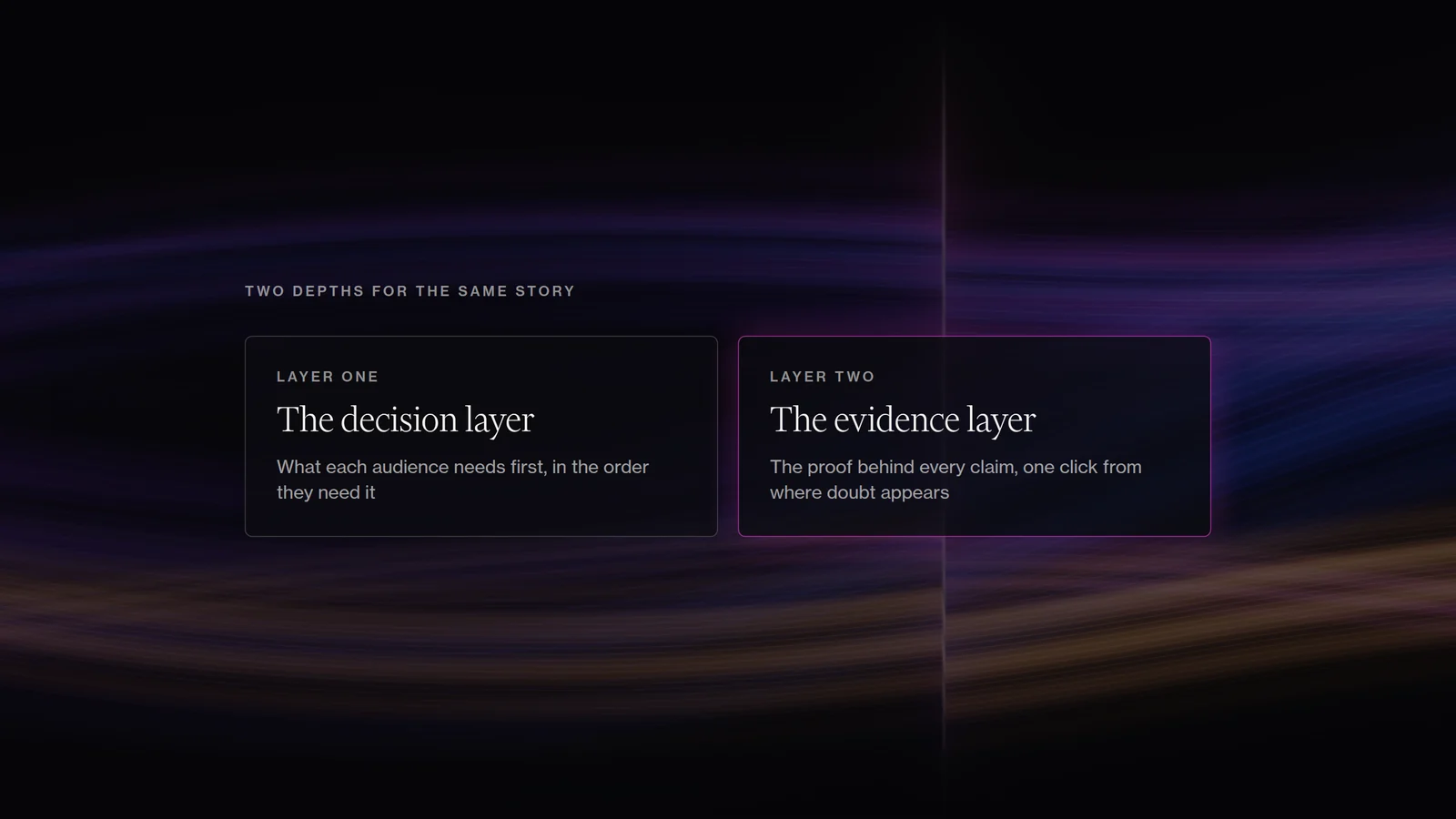
Sections
A company launches with a homepage, a product page, an About page and perhaps a few technical notes. Then the organisation grows. A new audience matters, so another page is added. A new programme needs a home, investors need more detail, a technical team publishes evidence and a project team adds deployments. Recruitment expands, and case studies, reports and partner material accumulate. Each addition makes sense when it is made.
The problem is that the website slowly stops behaving like one system. Visitors begin meeting a collection of useful pieces and having to work out for themselves how those pieces relate.
That is often the point when a team says it needs a redesign. In our experience, the deeper problem is usually information architecture. The organisation has evolved faster than the logic visitors use to enter it.
The site grows around the organisation, not the decision
Internal teams know where things belong because they know the company. They know which programme owns a report, why two similarly named products are different, which project came first, what is still experimental and what is commercially mature. A new visitor has none of that context and arrives with a question.
An investor may be asking whether the company can scale. A corporate buyer wants to know whether the product can work in their environment. A project developer wants to understand how to participate, and a technical reviewer wants to inspect methods and limitations. Those questions cut across an org chart.
That is why a website can look tidy and still feel difficult. The navigation may contain only six items, but the visitor still has to assemble the answer from four different sections.
The first job of a redesign is therefore to understand the decisions different audiences are trying to make. For each important audience, we usually want to know what they already understand, why they have arrived, what they need to know first, what doubt is likely to appear next, what evidence would answer that doubt and what they can realistically do after the visit. The page count and the sitemap come after that.
Fair Carbon already had audiences. The experience around them had become fragmented.
The earlier Fair Carbon site already contained strategic thinking. It recognised different users, and project leaders, investors and validation or accreditation actors had routes into the platform. There were maps, guidance, resources and project information.
The difficulty was how those pieces worked together. Important information had accumulated across the site and navigation had become harder. Visitors could see that Fair Carbon did several useful things, but it took too much effort to understand how those activities connected and where they belonged within them.
At the same time, the organisation itself was maturing. It was moving between science, project development, finance, communities and carbon markets, while the identity and digital experience still carried some of the character of an earlier-stage programme.
The work therefore started from the audience segmentation Fair Carbon already had. Its aim was to give the organisation a clearer centre and make the existing complexity easier to enter. Audience labels alone do not create information architecture.
Make the first layer easy to understand, then let the evidence deepen
Technical websites tend to fail in one of two directions. Some become so simple that a serious buyer cannot inspect the claims. Others lead with every method, caveat and technical detail, forcing a first-time visitor to solve the science before they understand why the work matters.
We prefer to think in two depths. The first is the decision layer. It helps somebody understand what the organisation is, who it is for, what changes because of its work, which proof matters first and what the next step is.
The second is the evidence layer. That is where a serious reader can inspect mechanism, methods, project status, deployments, data, validation, limitations and references. Both layers tell the same story at different depths.
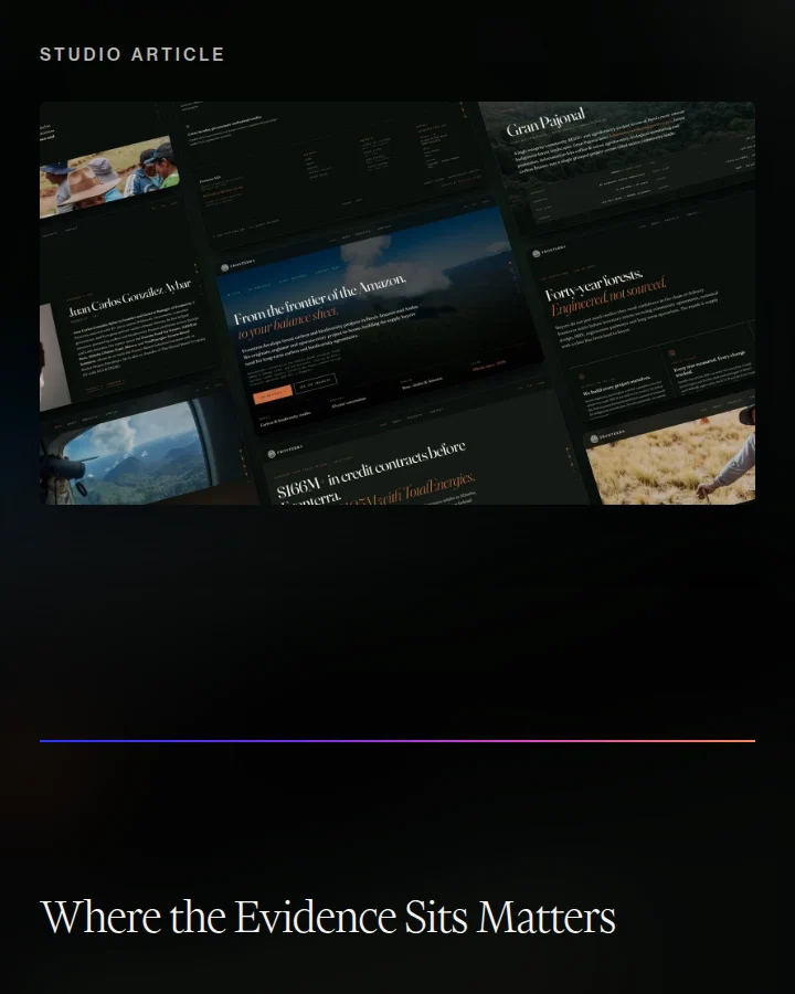
That was central to our work with Fronterra. The company already had substantial operating and project evidence, but too much of it sat behind broad climate language. The redesign moved the proof closer to the claims and brought the track record forward. Projects became easier to compare, and geography, methodology, status and operating context were easier to inspect.
The credibility was already there. The design changed where it appeared.
The homepage should orient, not absorb the whole company
One of the clearest signs of unresolved architecture is a homepage that keeps growing because every team wants its work represented there. A homepage has a smaller job. It should establish the position, show the main routes in, surface enough proof to earn another click and make the next action obvious.
Depth belongs where the question deepens. A technical buyer can move into methodology. An investor can move into projects, milestones and team. A partner can move into operating model and collaboration. The homepage should signal those routes without trying to complete them all.
The same principle helps a site survive growth. New projects, reports and programmes should fit into reusable structures, so the organisation can change without adding a new top-level navigation item each time. That is why information architecture should be designed for content that does not exist yet.
Better structure also makes expertise easier to retrieve
What helps a person understand a site also helps search and AI discovery. Retrieval systems benefit when a site is explicit about what a page is about, which organisation or product a claim refers to, how related ideas connect and where supporting evidence sits.
Clear writing serves both readers. Use descriptive headings and define unfamiliar terms. Keep important evidence in crawlable text, and avoid hiding it only inside graphics or PDFs. Give each important question one canonical page and avoid thin variants. Link commercial pages to relevant cases and deeper explanations.
A person should be able to understand the route through the site. A retrieval system should be able to understand the route through the subject. Those two goals are usually aligned.
A simple test before redesigning anything
Choose three important audiences and give the current site to somebody intelligent who does not work inside the organisation. Ask them to say what the organisation does, who it is for, what the main proof is, where they would go to inspect that proof and what they should do next.
Do not explain the navigation. Watch where they pause, reverse direction or open several pages to assemble one answer. Those moments are often more useful than another round of aesthetic feedback.
A climate or science website works when it gives the complexity of the work a structure people can move through.
Tell us what needs to move.
Bring the brief if it is clear. If it is unclear, tell us where the work is stuck.
Bring us the problem